 So, Jon Stubbington from the UK recently joined my virtual eBook launch team as head illustrator. Well, he’s actually the only illustrator, but the title sounds nice! I like his portfolio of illustrations that offer real life like images of people. Just as important is his approach to helping me select a great book cover for Heaven’s Ant Farm. You can see Jon’s illustration portfolio by clicking here: https://www.jonstubbington.com/
First, a little history… a few years ago, I put together a rough draft for my book cover that you see here. The goal of the book cover was to convey the telepathic relationship between two of the main characters, Yahweh and Gwendolyn while offering a peak of what Heaven’s ant farm actually looked like―the universe!
Jon come up with some interesting DRAFT illustrations to improve on the prototype book cover theme and I’d like to share them with you. In general, he added to the Yahweh, Gwendolyn, ant farm mix the struggle between Yahweh and Lucifer in several different forms that you see below.
So, Jon Stubbington from the UK recently joined my virtual eBook launch team as head illustrator. Well, he’s actually the only illustrator, but the title sounds nice! I like his portfolio of illustrations that offer real life like images of people. Just as important is his approach to helping me select a great book cover for Heaven’s Ant Farm. You can see Jon’s illustration portfolio by clicking here: https://www.jonstubbington.com/
First, a little history… a few years ago, I put together a rough draft for my book cover that you see here. The goal of the book cover was to convey the telepathic relationship between two of the main characters, Yahweh and Gwendolyn while offering a peak of what Heaven’s ant farm actually looked like―the universe!
Jon come up with some interesting DRAFT illustrations to improve on the prototype book cover theme and I’d like to share them with you. In general, he added to the Yahweh, Gwendolyn, ant farm mix the struggle between Yahweh and Lucifer in several different forms that you see below.
So, which of these do you like the best? Keep in mind these are ROUGH, idea-generating illustrations that will be refined. So, here we go….
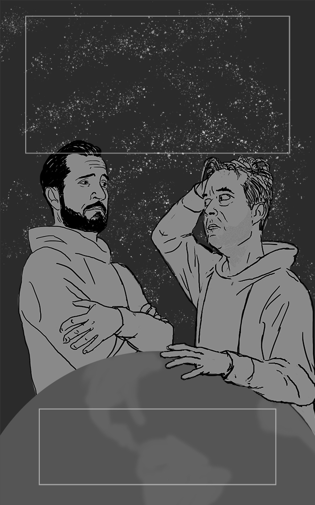 This image (minus the title lettering) highlights the struggle between Yahweh (on the right) and Lucifer while bringing to focus their impact on humans on Earth. Jon draws out the opposing character difference between these two individuals. One the evangelist, confident, strong and assured of his religious mission in life. The other a frazzled and unkept physicist clueless of human emotion but driven to somehow find the right road to save humankind on Earth.
 This image is basically the same as the first but includes a ghostly telepathic image of Gwendolyn who helps Yahweh keep his sanity and guides him as he battles Lucifer. Even after death, she remains connected to Yahweh, hence the ghostly image of her.
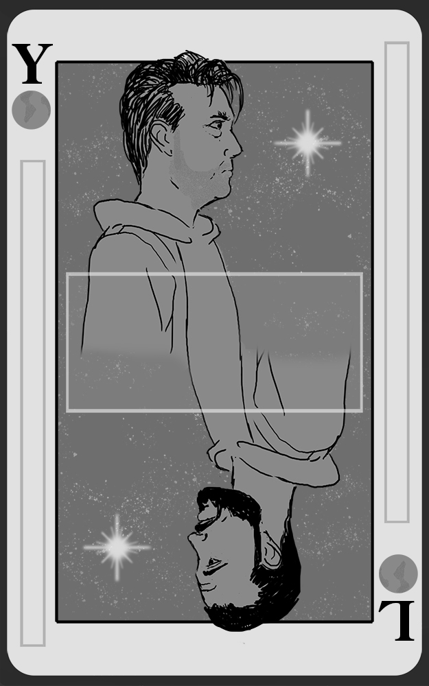 This illustration cleverly uses the playing card motif to subtly imply that Yahweh and Lucifer are playing games with humankind on Earth. The starburst (instead of the diamond) gives a node to the birth of the new universe where they are the are the “kings.” Indeed, the villagers in the Garden of Eden on Earth think of them as gods, much to Yahweh’s disgust.
Yahweh and Lucifer are presented here as mirror images of each other and a choice must be made between them. Heaven must decide if it will continue to be a scientific civilization or return to its religious roots that proceeded the Holy Nuclear War. Meanwhile, Earth must choose between loving freewill or irresponsible freewill. Either choice brings heavy consequences for Earth and Heaven!
This illustration cleverly uses the playing card motif to subtly imply that Yahweh and Lucifer are playing games with humankind on Earth. The starburst (instead of the diamond) gives a node to the birth of the new universe where they are the are the “kings.” Indeed, the villagers in the Garden of Eden on Earth think of them as gods, much to Yahweh’s disgust.
Yahweh and Lucifer are presented here as mirror images of each other and a choice must be made between them. Heaven must decide if it will continue to be a scientific civilization or return to its religious roots that proceeded the Holy Nuclear War. Meanwhile, Earth must choose between loving freewill or irresponsible freewill. Either choice brings heavy consequences for Earth and Heaven!
 This image illustrates the dilemma Yahweh faces. Here, in Yahweh’s mind, Lucifer is more powerful and has the upper hand that drives the dramatic tension between the two. And Lucifer’s successful influence both in Heaven and on Earth makes it an uphill battle for Yahweh as he tries to help humankind on Earth. But through all of this, Gwendolyn is always with him, first physically then in spirit after her death.
That submarine like item is the spaceship Kakabel that orbits Earth while Yahweh along with a squad of Cherubim soldiers hunt down Lucifer in the Garden of Eden. The Kakabel’s design has obvious naval influences. Think about it . . . subs are completely sealed vessels that operate in a hostile environment. They are like spaceships but travel under the sea. It’s cylindrical shape also lends well for artificial gravity.
This image illustrates the dilemma Yahweh faces. Here, in Yahweh’s mind, Lucifer is more powerful and has the upper hand that drives the dramatic tension between the two. And Lucifer’s successful influence both in Heaven and on Earth makes it an uphill battle for Yahweh as he tries to help humankind on Earth. But through all of this, Gwendolyn is always with him, first physically then in spirit after her death.
That submarine like item is the spaceship Kakabel that orbits Earth while Yahweh along with a squad of Cherubim soldiers hunt down Lucifer in the Garden of Eden. The Kakabel’s design has obvious naval influences. Think about it . . . subs are completely sealed vessels that operate in a hostile environment. They are like spaceships but travel under the sea. It’s cylindrical shape also lends well for artificial gravity.
So, which of these do you like the best? Should they have different poses? Perhaps you have an idea for better a cover illustration? Your Comments Are Welcomed!

Most drawn to the playing card image given that book covers serve as marketing tools which often act as catalyst or spark intrigue causing potential readers to grab a tome. Titles are supplemented by cover images and the opposing forces faced on a single play (ing card) immediately establishes strength for both pulls/poles and titillates my interest to see who wins. Sci-fi very often verges on the obscure; ubiquitous dualities wherein the reader becomes a participant as interpretations of events found in the work are as important as the concrete details offered by the author. Similarly, the opposing rulers on the face of a suit yet unknown (star vs diamond) in lieu of royals leaves me convinced there’s much to untangle in the tale which unfolds in this tome.
As for the other proposed covers, personally, I find them less engaging and the facial expressions douse the fire of my intrigue.
Wow, excellent observations Ira, which gives me an idea to change the book title from “Heaven’s Ant Farm” to “God Games.” Hummmmm…. Thanks much!!!
I think you have to include some Heaven imagery so as not to put the onus on the person looking at the book for the first time to interpret the deeper meaning conveyed in the book. Personally, if I looked at the title of your book with an image of a card or 2 men looking as though they are struggling, I would think there is a disconnect between the title and the imagery. I think the two have to be more cohesive.
I agree with the disconnect between the current book title and the playing card illustration. And it occurred to me that in a strange way the book presents these two characters’ struggle against each other as a game with direct consequences for humankind on Earth. So, I’m considering changing the title to something like “God Games.” Need to be sure that title hasn’t already been taken. But if so, then so what?THANKS for your observations!
Definitely the playing card. Suggests a duality within us all.
I don’t think the cover should be just about the two men, Yahweh and Lucifer. They’re important, but I’m even more interested in the Ant Farm, Earth (after all, I live there 🙂 ). The book is not just about the struggle between the two figures, but about what they’re struggling over. Maybe use your first image with Y, G, and the gaseous nebula, but in the foreground have Eve and another human, where Eve is holding fruit and wears an angry expression of “I have to protect my resources!” Or the image of L, Y, G, and the Earth, but including a close-up of a city on the Earth with signs of struggle. …The artist draws Yahweh as thoughtful and strong, but flawed, with those pursed lips. That is what indeed what your Y is like. But a prospective reader glancing at the cover for the first time will notice the flaws but won’t know why. They might think Y is an anti-hero based on weakness, but I think he’s a hero.
Thanks Mark for your comment and observation. Yes, it’s more than just Yahweh and Lucifer but the decisions humankind makes between the two . . . and the resulting actions and consequences in the Garden of Eden continue to parallel present day challenges.